
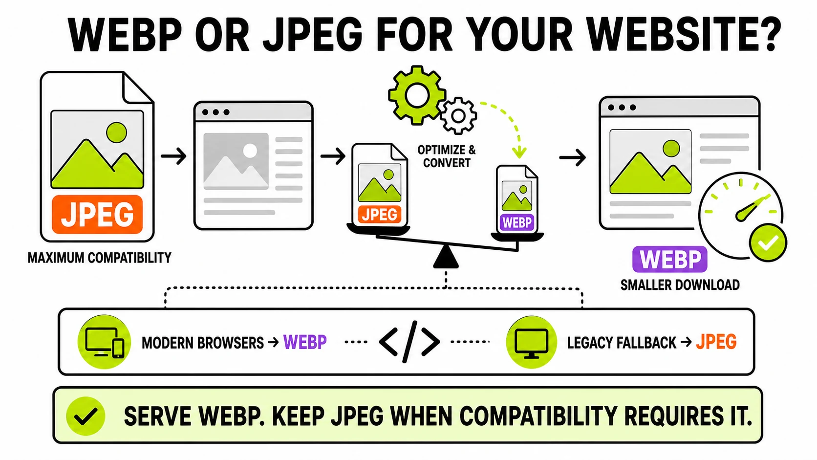
For most websites, serve WebP for photographs and keep JPEG only where a compatibility fallback or downloadable original is genuinely needed. WebP usually delivers fewer bytes at similar visible quality, supports transparency, and works in every current major browser. The format helps, but it does not replace correct dimensions, responsive images, or sensible compression.
What is the practical difference between WebP and JPEG?
Both formats can compress photographs lossily: they discard visual detail to make a smaller file, with a quality setting controlling how far the encoder goes. JPEG has been doing that since the early web. WebP uses a newer encoding approach and usually stores a visually comparable photograph in less space.
The difference matters because images are often among the largest resources a page downloads. A smaller hero photograph or product gallery means fewer bytes crossing the network before the browser can paint the page. That can improve load time, especially on mobile connections, and may help Largest Contentful Paint when the image is the page’s largest visible element.
WebP also handles jobs JPEG cannot. It supports transparency and can be encoded losslessly, while JPEG is always opaque and lossy. That does not mean every graphic should automatically become WebP: SVG remains better for scalable icons and logos, and PNG can still be appropriate for exact raster pixels in workflows that do not accept WebP. The broader JPG, PNG, and WebP guide covers those content choices; this article is specifically about delivery on a website.
How much smaller is WebP than JPEG?
There is no honest percentage that applies to every image. The result changes with the encoder, quality setting, dimensions, and content. A detailed photo, a smooth sky, and a screenshot with text react differently even when they have identical pixel dimensions.
WebP commonly beats JPEG at comparable visual quality, but the only number that matters for your page is the one produced by your files. Convert a representative set, compare each result at the size visitors actually see, and record the byte difference. If a 240 KB JPEG becomes a clean 150 KB WebP, the replacement is useful. If an aggressively compressed JPEG becomes a nearly identical 235 KB WebP, changing the extension achieves little.
JPG to WebPCompare the source and WebP output locally, adjust quality, and see the exact file-size difference before downloading.
Test a website image →Does every browser support WebP now?
Every current major browser supports WebP, including Chrome, Edge, Firefox, Safari, and their mobile versions. The remaining compatibility concern is not ordinary modern browser traffic. It is old operating systems, abandoned embedded webviews, legacy enterprise software, email clients, and downstream users who download an image and open it outside the browser.
That distinction changes the recommendation. A normal consumer website can
serve WebP directly with an ordinary <img> element. A site with contractual
support for old environments, or one whose images are meant to be downloaded
and reused, may still provide JPEG as a fallback or separate download.
The MDN image-format guide tracks format capabilities and browser considerations when your support requirements extend beyond current browsers.
Should you use a picture element with a JPEG fallback?
Use <picture> when you have a real fallback requirement or want to offer
multiple modern formats. The browser evaluates each source in order and uses
the first format it understands, while the nested <img> remains the final
fallback and carries the alt text and dimensions.
<picture>
  <source srcset="product.avif" type="image/avif">
  <source srcset="product.webp" type="image/webp">
  <img
    src="product.jpg"
    alt="Black desk lamp with an adjustable brass arm"
    width="1200"
    height="800"
  >
</picture>
This pattern is robust, but it creates more files to encode, store, and keep
in sync. Do not generate three versions of every image by habit if your
audience only needs one. For many modern sites, responsive WebP sources plus
a WebP <img> are enough. Add JPEG because a measured support requirement
exists, not because fallback markup looks more thorough.
What quality setting should website WebP images use?
Start near 80 for ordinary photographs, then judge the actual image. Quality numbers are encoder controls, not universal percentages of retained detail. An 80 in one tool is not guaranteed to match an 80 in another.
Inspect the places where compression fails first:
- Smooth skies and studio backdrops can develop banding.
- Hair, foliage, and fabric can become waxy or smeared.
- Text and hard product edges can show ringing.
- Skin tones can lose subtle texture before the whole image looks obviously damaged.
Compare at the image’s rendered size, but also zoom in once to catch damage that may become visible on a high-density display. Stop lowering quality when the next file-size reduction costs visible detail. The right endpoint is a visual decision backed by the live byte count, not a single recommended number copied across the whole site.
Does converting to WebP solve image performance by itself?
No. Format is one lever, and often not the largest one. A 4000-pixel WebP displayed at 800 pixels still makes the visitor download far more image than the layout needs. Fix dimensions before chasing encoder differences.
A complete website-image pass should do the following:
- Resize the source close to its largest rendered size.
- Create responsive widths with
srcsetwhen the layout changes substantially across devices. - Encode each candidate at a visually acceptable quality.
- Include
widthandheightso the browser reserves space before loading. - Load the above-the-fold hero normally, and lazy-load images farther down.
- Cache versioned assets for a long time.
If an image is too large before conversion, resize it first. Then compress the remaining pixels. A correctly sized JPEG can outperform an oversized WebP; a correctly sized WebP usually gives you the strongest result of the two.
When should a website keep JPEG instead?
JPEG remains the pragmatic choice in several cases:
- The image is a downloadable asset expected to open in old desktop software.
- A feed, marketplace, CMS, printer, or partner system explicitly requires
.jpgfiles. - The same file is reused in email, where format behavior is less predictable than in current browsers.
- Your existing JPEG is already small, clean, cached everywhere, and the measured WebP saving is negligible.
- Your image pipeline cannot reliably generate and validate WebP outputs yet.
Compatibility is a workflow property, not just a browser-support table. The website may display WebP perfectly while the person downloading the image cannot use it in the next tool. In that situation, serve WebP on the page and offer a JPEG download deliberately.
What is the recommended migration workflow?
Do not replace an entire image library blindly. Start with the heaviest and most visible images: homepage heroes, product photos, article covers, and large gallery assets. Those produce the clearest performance return.
Keep the original master, create WebP derivatives from that master, and avoid re-encoding an already compressed copy repeatedly. Test the output visually, deploy a small group, and compare transfer size and page metrics. Once the pipeline is reliable, expand it to the rest of the site.
The working rule is simple: WebP is the default delivery format for a modern website; JPEG is the compatibility format you keep when a specific browser, tool, or download workflow still needs it. Convert from the best source, right-size first, and measure the files you actually ship.