
Usually it’s not the phone, the screen, or the app you think is broken - it’s a color profile mismatch somewhere between capture and display. iPhones shoot in a wider color space than the web’s default, and if anything in the path - the sending app, the receiving app, or an intermediate conversion - doesn’t handle that correctly, colors shift. Here’s what’s actually happening and how to tell which part is the cause.
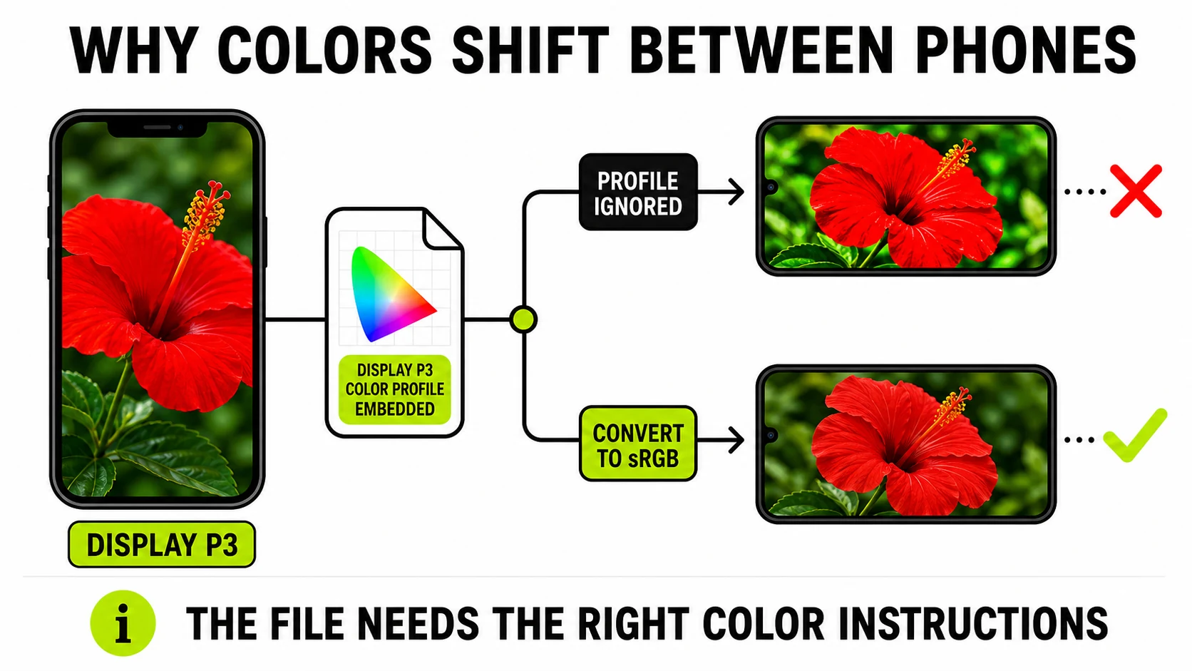
The real cause: Display P3 vs sRGB
iPhones capture using Display P3, a wider color gamut than sRGB, the color space the web and most non-Apple software has standardized on for decades. Both are valid - P3 can represent more vivid reds and greens than sRGB can. The photo carries an embedded color profile telling any app that opens it “these pixel values mean this range of colors.”
The problem starts when something in the chain ignores that instruction. An app that reads the P3 values as if they were plain sRGB numbers renders the photo differently - typically oversaturated or shifted, since it’s displaying wide-gamut values without the wide-gamut context. Browsers and recent OS-level viewers generally handle this correctly; older software, some messaging apps, and certain upload pipelines strip or ignore the profile, which is usually the actual culprit when a photo “looks wrong” after a transfer.
In practice this shows up most in exactly the colors P3 was built to extend: reds and greens. A sunset, a red car, or saturated foliage shot on an iPhone can look noticeably more vivid on a P3-aware screen than the same file does once it’s passed through a pipeline that mishandles the profile
- not because the data changed, but because the instructions for interpreting it got lost. Skin tones and blues tend to shift less dramatically, which is part of why the effect is inconsistent and hard to pin down from memory alone (“it looked fine yesterday, why not today” is usually a different app or a different path, not a different phone).
Apple adopted P3 because their own displays - iPhone, iPad, Mac - are wide- gamut panels capable of showing that extended range, so capturing and displaying in P3 end-to-end shows genuinely more color than sRGB allows. The trade only becomes a problem the moment the photo leaves that closed loop for a device or app that assumes sRGB.
The second cause: a HEIC-to-JPG detour you didn’t ask for
Most cross-platform sharing paths convert HEIC to JPG somewhere along the way, because Android and most non-Apple apps can’t open HEIC directly. That conversion is a second opportunity for color to shift - a well-made converter normalizes the image into standard sRGB during the conversion (which is what makes it viewable consistently everywhere), but a low-effort one can mishandle the profile the same way a viewer can, baking a color shift permanently into the new file.
HEIC to JPGConvert iPhone photos to a JPG that renders consistently everywhere - decoded and re-encoded on your device.
Convert a HEIC photo →The part that isn’t fixable in the file: the screen itself
Even with a perfectly color-managed file, two physical screens can render the same sRGB values slightly differently - panel technology, factory calibration, and brightness settings all shift what “the same red” looks like. OLED and LCD panels in particular render saturation and black levels differently by design, independent of any color management happening correctly. This part is honestly out of scope for any file-level fix; if a side-by-side comparison on the same device still looks different after ruling out the profile and conversion issues above, the screens themselves are the remaining variable, and no amount of re-encoding the file will change it.
A quick way to tell which cause you’re looking at
- Looks oversaturated or off-color right after sending, same device you viewed it on before → profile mismatch in the app that displayed it.
- Looks fine in one app, wrong in another, same phone → the second app isn’t color-managing correctly.
- Colors shifted and detail looks slightly softer or blockier → a lossy HEIC-to-JPG conversion happened somewhere in the pipeline, not just a profile issue.
- Looks different only when compared across two different phones → likely just the screens, not the file.
How to actually check what’s going on
Run the photo through an EXIF/metadata viewer - if it flags an embedded color profile, that’s your wide-gamut source file, and the receiving app or an intermediate conversion is the likely point of failure. If no profile shows up, the image is already normalized to sRGB and the difference is more likely the screens themselves.
For sending a photo where consistent color matters more than squeezing out the last bit of vibrance - a product photo, a print proof, anything judged by exact color - converting explicitly through JPG or PNG before sending removes the ambiguity, rather than hoping every app in the chain handles the wide-gamut original correctly.
Does this affect video and Live Photos too?
The same profile mismatch applies to video, though it’s less commonly noticed because video is watched more than pixel-inspected. Live Photos add another layer entirely - they’re a paired still image and a few seconds of video/audio, and an app that doesn’t understand the pairing typically shows just the still frame, which is a separate compatibility issue from color, not a color problem itself.
Every conversion and check above happens locally in the browser tab - the original file’s color data isn’t sent to a server to be read or corrected.